Encaustic painting with brushes

First time doing encaustic painting with bristle brushes.
The painting was on unprimed 12mm MDF with a sketch in medium-soft (B) graphite.

Observations

The brushes didn’t drink the paint the way I expected. I suppose that’s because encaustic has more in common with oil paint than watercolour. It’s been more than ten years since I last used oil, so I was a little worried that I’d be starting from scratch, but I soon got into the swing of it.

Perhaps because I was expecting the brushes to absorb the paint more than they did, the paint went further than I expected. I’ve barely made dent in my supply and I was using it unthinned.

The initial strokes with a loaded brush were quite pleasant. The paint went down well and covered a good amount of the board, the graphite sketch didn’t seem to interfere with the application, and even though the wax cooled rapidly on the brushes, it was easily reactivated on the hot plate.

The first attempt never got the initial Ugly stage

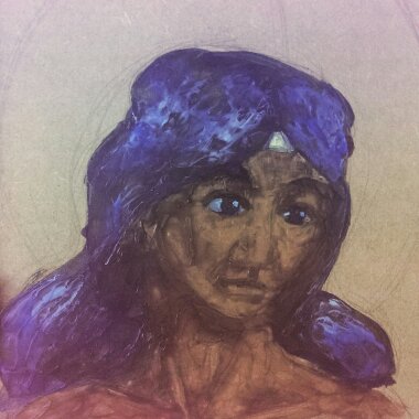
Unfortunately, some fairly significant issues emerged during the first session.
The quality of the marks left much to be desired: the initial contract with the board often left a blob of paint which rapidly hardened, resulting in a blotchy, uneven tone and surface. Worse than that, new strokes would lift the previous layers, creating bald patches that exposed the board below.

Both problems were very probably caused by me not fusing the paint until after the session.

At the end of the session, I used the heated stylus with a palette knife attachment to fuse the wax and manipulate it. I also used it to apply some opaque colours to add tints to the image, bit that’s very much within the sphere of how I’ve been using encaustic paint up to now.

Once the paint was fused, the quality of the blending and adhesion improved noticeably.

The second attempt, on primed board, was much more successful

Conclusion

This being a materials test, I didn’t think in necessary to prime the MDF and I think that hindered my ability to assess the medium properly. Due to the colour of the wood and the translucency of the paint, MDF isn’t suited to being used raw and needs to primed before use.

Ultimately, I intend to move on to ‘proper’ wood, birch ply and solid wood blocks, which will all have their own learning curve, but I’ll continue the paint tests on MDF due to its relative affordability.

One thing that this really drove home was the need to fuse paint between layers. I might look into using a blowtorch to minimise disturbing the paint, but I’ll have to be mindful of not singeing the board as MDF releases toxic vapours when burned.

Notes for next time

  • Prime the board
  •  Fuse between layers

Future exploration

  • Prime the board using clay paint
  •  Prime the board using wax
  •  Prime the board using encaustic gesso (?)
  •  Try heated palette knives (not the stylus)
  •  Use a blowtorch for fusing
  •  Mix with oil paint, oil pastel, MPO
  •  Try a tonal under-drawing in graphite and/or charcoal
  •  Include pyrography and graphic elements (not on MDF!)
  •  More encaustic techniques – etching, filling, inclusions, scraping back, burnishing, impasto, dripping, pouring…

The Practice and Science of Drawing – Chapter 3

Vision

“The act of painting or drawing is not so simple as replicating what one sees; first, the student must learn to see.”

“Pictures on the retina – vision – are flat and, if examined without prejudice, composed of masses of colour in infinite variety with various edges. The flat nature of the individual retina-picture is mitigated by the use of two eyes but even then, we can only focus on a single distance.”

Through experience, we’ve learned to associate touch sensation with visual texture and the goal of the artist is to replicate visual texture with enough accuracy that the viewer can recall the feel of the material. Speed says that it’s this link between the visual and the tactile that gives children’s drawings their characteristic look – they’re not drawing what they see, but what they physically feel:

“A head [is] an object having a continuous boundary in space. This his mind instinctively conceives as a line. Then, hair he expresses by a row of little lines coming out from the boundary, all round the top. He thinks of eyes as two points or circles, or as points in circles, and the nose either as a triangle or an L-shaped line. […] The mouth similarly is an opening with a row of teeth, which are generally shown although so seldom seen, but always apparent if the mouth is felt.”

Twins Early Development Study/King’s College in London

A phrase from primary school keeps coming back to me when I think on how to encourage students past this stage – ‘look with your eyes not your hands’.
Equally though, the artist needs to give an impression of the volume of the form, so slavish precision isn’t to be encouraged either. A balance must be stuck between the appearance of the thing and the essence of the thing.

Complicating the artist’s job is the fact that people look for information in objects beyond their physical appearance – looking at the sky to check the weather, or at a river to see how deep or fast it is. I think this is part of the mindset that abstract art either has no merit or requires no skill. If people see without looking or look without seeing for the majority of the time, what use do they have for a thing that doesn’t look like it’s supposed to (avoiding the question of the utility and purpose of art)?

Details from Millais' Ophelia
Millais’ Ophelia – detail everywhere!

Picking out the most important elements of a thing to make a picture aesthetically appealing often means leaving out the detail required for an object to read correctly.

Speed points to the Pre-Raphaelite Brotherhood as an example of an exception to the rule (“in their work the excessive realisation of all details […] gave emphasis to the poetic idea at the basis of their pictures, and was therefore part of the artistic intention […] every detail being selected on account of some symbolic meaning it had”) but, in the main, excessive detail makes it difficult to identify the important elements in the scene and the message of the painting is lost. 

On the purpose of art

“It is the privilege of the artist to show how wonderful and beautiful [the everyday world is], so that people, having been moved by it in his work, may be encouraged to see the same beauty in the things around them.”

The naive approach to art – outlining masses according to touch – might be part of what gives cartoon drawings their association with childishness in the West. Obviously that’s reinforced by notable examples of badly-written, poorly-drawn books and TV shows designed as extended adverts for plastic tat, but, beyond that, cartoons carry the stigma of ‘not real art’ in cultures with a history of realism.

Scott McCloud’s Understanding Comics talks about the phenomenon of characters as icons vs.characters as actors, and the way we identify more readily with characters who are more symbolic representations of a figure (eg: The Moomins, Tin Tin) than with characters who are highly detailed (eg: Marvel or DC characters). I can’t help but wonder: how does this apply to painted figures? Does colour vs monochome affect projection? What about realism in painting vs stylisation?

Further reading and sources

Drawing on the Right Side of the Brain – chapters 1-3

Chapter summary

Drawing is a global skill, based on a finite set if components. Like other global skills (eg: reading, driving, walking), drawing becomes automatic with practice and no longer requires attention to the component parts. The five basic skills of drawing are:

  • Perception of edges
  • Perception of spaces
  • Perception of relationships
  • Perception of light and shadow
  • Perception of the whole

There are also two additional, advanced skills: drawing from memory and drawing from imagination
The fifth skill (perception of the whole) develops as a natural extension of the first four and does not require specific training, but the first four are pretty much compulsory. Edwards recommends practising them in the order of line > value > colour > painting, much like Speed.

The first few chapters spend a long time discussing the science behind the DRSB method, as well as the repetition of the fundamental assumption of the book: that “drawing is a skill that can be learned by every normal person with average eyesight and average eye-hand coordination” (p3), and that the student does not need to learn how to draw so much as they need to learn how to see by actively engaging their brain in the activity.

“To put it another way, you already know how to draw, but old habits of seeing interfere with that ability and block it.” (p7)

Switching between brain modes

When deciding between the left- and right-brain modes, Edwards says that neuroscientists believe that tasks are performed by one hemisphere or another based on either how fast the hemisphere begins to tackle the task, or which hemisphere most likes the task (perhaps this is the subconscious mind assigning tasks to the thought process it feels is best suited). The dominant left- brain will turn down tasks that are outside its comfort zone, and the assignments in the book are designed to activate the right hemisphere by presenting the left-brain with tasks it is supremely unsuited to.

Drawing as an altered state of consciousness

In DRSB, the key to learning to draw is to create a shift in consciousness which suppresses the language-processing parts of the brain (shift to R-mode, suppress L-mode) and to become familiar enough with this process that it can be triggered at will.

“One drawing task is no harder than any other. The same skills and ways of seeing are involved in drawing still-life setups, and portrait drawing. It’s all the same thing.” (p8)

Exercises

Drawing my self-portrait was an interesting exercise; I hadn’t appreciated how much my glasses shrank my eyes and it’s the one area I feel is particularly inaccurate – the natural inclination to emphasise the the eyes in addition to knowing that my eyes aren’t as small as they appear has led to inconsistencies. Also, I don’t think my nose is that long.

Exercise 1: Pre-Instruction Self-Portrait

My hand was the first of the pre-instruction drawings I attempted, and it looks like a warm-up piece to me. The lines are heavy and the fingers bear more than a passing resemblance to sausages. It’s not a bad drawing, but it’s not great.

Exercise 2: Pre-Instruction Hand Drawing

I should have taken a break between drawings and I think this is particularly evident with the still-life. The keys were the last things added to the picture and they are definitely not representative of what I could see. Not pictured in this scan: atrocious planning skills – the left of the picture is butted up against the spine of the book while the right disappears into the void.

Exercise 3:Pre-Instruction Still Life

The drawing from memory task wasn’t in the workbook I had, but was in the theory book (my theory book was published later than my workbook), where Edwards discusses the use of symbols which characterises child-like drawings and insinuates itself in observational drawings when the artist hasn’t yet developed the skill to accurately observe the forms in front of them. Enough said, really.

Exercise 3.5: Pre-Instruction Drawing from Memory

I suppose that most people don’t have the same amount of experience with making different marks and enjoy the chance to experiment. I certainly enjoyed it, but I’m not sure how much I learned. Perhaps I need to be more varied in the marks I use rather than going for the same direct approach each time.

Exercise 4:Warm-Up Free Drawing