Blog

The Practice and Science of Drawing – Chapter 4

Line drawing

Line drawing is the oldest and most common style of art and, whether the line is drawn, painted, incised or raised, it has been part of art since prehistory. That said, it wasn’t until the renaissance that artists were able to transcend the line into representation of mass (Speed credits Leonardo da Vinci with developing perception sufficiently of overcome the ‘colouring between the lines’ of earlier artists, including masters like Botticelli).

Botticelli vs. da Vinci

As Speed explained in the last chapter, using line to show the boundaries of mass is the first expression of our understanding of the world, and this is why many beginning artists struggle to depict lost edges and why many pictures that rely heavily on imagination are predominantly line-based.

“Most artists whose work makes a large appeal to the imagination are strong on the value of line. Blake, whose visual knowledge was such a negligible quantity, but whose mental perceptions were so magnificent, was always insisting on its value. And his designs are splendid examples of its powerful appeal to the imagination.”

Perhaps this is why many artists who draw from imagination sketch with line, regardless how the choose to render the final piece. Taking a line for a walk allows you to explore an idea in a way that blocking in masses doesn’t permit for.

When da Vinci said “the first object of a painter is to make a simple flat surface appear like a relievo, and some of its parts detached from the ground; he who excels all others in that part of the art deserves the most praise,” ‘relief illustration’ was novel and, although the artists of the time were beginning to move away from the outline and colour model, it wasn’t until Velázquez that the idea of a painting being ‘objects in space’ (as opposed to images of a plane) was challenged or vision was used as more than an aid to some mental model.

Velázquez’ Las Meninas

Here, Speed suggests that art has, in some ways, suffered for the move away from line. In accordance with his theory that line suggests an innocence or primitive quality, he feels that later works lack the freshness of a Botticelli, and highlights one of the dangers of an overly natural approach: that the viewer becomes distracted; looking not at the painting, but at the landscape it represents, applying the same information-gathering thought processes they would if confronted with the scene in real life.

For this reason, the artist must be disciplined in their approach to detail – “the accumulation of the details of visual observation in art is liable eventually to obscure the main idea and disturb the large sense of design on which so much of the imaginative appeal of a work of art depends.”

The key traits of line are simplicity, purity, imagination and design; excessive detail and visual fidelity is a detriment to the benefits of linework.

In Speed’s opinion, the highest pinnacle of art is “when to the primitive strength of early at are agreed the infinite refinements and graces of culture without destroying or weakening the sublimity of the expression”.

In Speed’s opinion, the refinement and graces of culture for painters are an increasingly faithful adherence to the appearance of nature. The height of this refinement was in the mid-nineteenth century and, by the time Speed wrote TPaSoD, he felt that art had become ‘misdirected’ by influences from distant countries and artists’ response to  technology (Japanese ukiyo-e prints came to Europe in the 1860s and the daguerreotype camera was released in 1839). Artists, most notably the Impressionists, rebelled against photorealism and argued that it was impossible or undesirable to beat the camera at depicting reality; others, characterised by the Japonism movement, drew on the style and influence of non-Western cultures and began to paint in increasingly stylistic fashions.
I’m not sold on this theory of the decline of art, to be honest. It seems too much like every generation lamenting the decline of the young people of today. Although the early Impressionists don’t do much for me, I see it as the start of painting finding an identity and a purpose once it’s primary function (that of documenting reality) is performed better, faster and cheaper by something else. The start of art’s turbulent teenage years, or it’s mid-life crisis?


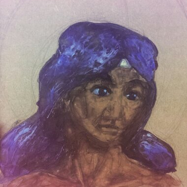
Images from Wikimedia Commons.

Encaustic painting with brushes

First time doing encaustic painting with bristle brushes.
The painting was on unprimed 12mm MDF with a sketch in medium-soft (B) graphite.

Observations

The brushes didn’t drink the paint the way I expected. I suppose that’s because encaustic has more in common with oil paint than watercolour. It’s been more than ten years since I last used oil, so I was a little worried that I’d be starting from scratch, but I soon got into the swing of it.

Perhaps because I was expecting the brushes to absorb the paint more than they did, the paint went further than I expected. I’ve barely made dent in my supply and I was using it unthinned.

The initial strokes with a loaded brush were quite pleasant. The paint went down well and covered a good amount of the board, the graphite sketch didn’t seem to interfere with the application, and even though the wax cooled rapidly on the brushes, it was easily reactivated on the hot plate.

The first attempt never got the initial Ugly stage

Unfortunately, some fairly significant issues emerged during the first session.
The quality of the marks left much to be desired: the initial contract with the board often left a blob of paint which rapidly hardened, resulting in a blotchy, uneven tone and surface. Worse than that, new strokes would lift the previous layers, creating bald patches that exposed the board below.

Both problems were very probably caused by me not fusing the paint until after the session.

At the end of the session, I used the heated stylus with a palette knife attachment to fuse the wax and manipulate it. I also used it to apply some opaque colours to add tints to the image, bit that’s very much within the sphere of how I’ve been using encaustic paint up to now.

Once the paint was fused, the quality of the blending and adhesion improved noticeably.

The second attempt, on primed board, was much more successful

Conclusion

This being a materials test, I didn’t think in necessary to prime the MDF and I think that hindered my ability to assess the medium properly. Due to the colour of the wood and the translucency of the paint, MDF isn’t suited to being used raw and needs to primed before use.

Ultimately, I intend to move on to ‘proper’ wood, birch ply and solid wood blocks, which will all have their own learning curve, but I’ll continue the paint tests on MDF due to its relative affordability.

One thing that this really drove home was the need to fuse paint between layers. I might look into using a blowtorch to minimise disturbing the paint, but I’ll have to be mindful of not singeing the board as MDF releases toxic vapours when burned.

Notes for next time

  • Prime the board
  •  Fuse between layers

Future exploration

  • Prime the board using clay paint
  •  Prime the board using wax
  •  Prime the board using encaustic gesso (?)
  •  Try heated palette knives (not the stylus)
  •  Use a blowtorch for fusing
  •  Mix with oil paint, oil pastel, MPO
  •  Try a tonal under-drawing in graphite and/or charcoal
  •  Include pyrography and graphic elements (not on MDF!)
  •  More encaustic techniques – etching, filling, inclusions, scraping back, burnishing, impasto, dripping, pouring…

The Practice and Science of Drawing – Chapter 3

Vision

“The act of painting or drawing is not so simple as replicating what one sees; first, the student must learn to see.”

“Pictures on the retina – vision – are flat and, if examined without prejudice, composed of masses of colour in infinite variety with various edges. The flat nature of the individual retina-picture is mitigated by the use of two eyes but even then, we can only focus on a single distance.”

Through experience, we’ve learned to associate touch sensation with visual texture and the goal of the artist is to replicate visual texture with enough accuracy that the viewer can recall the feel of the material. Speed says that it’s this link between the visual and the tactile that gives children’s drawings their characteristic look – they’re not drawing what they see, but what they physically feel:

“A head [is] an object having a continuous boundary in space. This his mind instinctively conceives as a line. Then, hair he expresses by a row of little lines coming out from the boundary, all round the top. He thinks of eyes as two points or circles, or as points in circles, and the nose either as a triangle or an L-shaped line. […] The mouth similarly is an opening with a row of teeth, which are generally shown although so seldom seen, but always apparent if the mouth is felt.”

Twins Early Development Study/King’s College in London

A phrase from primary school keeps coming back to me when I think on how to encourage students past this stage – ‘look with your eyes not your hands’.
Equally though, the artist needs to give an impression of the volume of the form, so slavish precision isn’t to be encouraged either. A balance must be stuck between the appearance of the thing and the essence of the thing.

Complicating the artist’s job is the fact that people look for information in objects beyond their physical appearance – looking at the sky to check the weather, or at a river to see how deep or fast it is. I think this is part of the mindset that abstract art either has no merit or requires no skill. If people see without looking or look without seeing for the majority of the time, what use do they have for a thing that doesn’t look like it’s supposed to (avoiding the question of the utility and purpose of art)?

Details from Millais' Ophelia
Millais’ Ophelia – detail everywhere!

Picking out the most important elements of a thing to make a picture aesthetically appealing often means leaving out the detail required for an object to read correctly.

Speed points to the Pre-Raphaelite Brotherhood as an example of an exception to the rule (“in their work the excessive realisation of all details […] gave emphasis to the poetic idea at the basis of their pictures, and was therefore part of the artistic intention […] every detail being selected on account of some symbolic meaning it had”) but, in the main, excessive detail makes it difficult to identify the important elements in the scene and the message of the painting is lost. 

On the purpose of art

“It is the privilege of the artist to show how wonderful and beautiful [the everyday world is], so that people, having been moved by it in his work, may be encouraged to see the same beauty in the things around them.”

The naive approach to art – outlining masses according to touch – might be part of what gives cartoon drawings their association with childishness in the West. Obviously that’s reinforced by notable examples of badly-written, poorly-drawn books and TV shows designed as extended adverts for plastic tat, but, beyond that, cartoons carry the stigma of ‘not real art’ in cultures with a history of realism.

Scott McCloud’s Understanding Comics talks about the phenomenon of characters as icons vs.characters as actors, and the way we identify more readily with characters who are more symbolic representations of a figure (eg: The Moomins, Tin Tin) than with characters who are highly detailed (eg: Marvel or DC characters). I can’t help but wonder: how does this apply to painted figures? Does colour vs monochome affect projection? What about realism in painting vs stylisation?

Further reading and sources

Drawing on the Right Side of the Brain – chapters 1-3

Chapter summary

Drawing is a global skill, based on a finite set if components. Like other global skills (eg: reading, driving, walking), drawing becomes automatic with practice and no longer requires attention to the component parts. The five basic skills of drawing are:

  • Perception of edges
  • Perception of spaces
  • Perception of relationships
  • Perception of light and shadow
  • Perception of the whole

There are also two additional, advanced skills: drawing from memory and drawing from imagination
The fifth skill (perception of the whole) develops as a natural extension of the first four and does not require specific training, but the first four are pretty much compulsory. Edwards recommends practising them in the order of line > value > colour > painting, much like Speed.

The first few chapters spend a long time discussing the science behind the DRSB method, as well as the repetition of the fundamental assumption of the book: that “drawing is a skill that can be learned by every normal person with average eyesight and average eye-hand coordination” (p3), and that the student does not need to learn how to draw so much as they need to learn how to see by actively engaging their brain in the activity.

“To put it another way, you already know how to draw, but old habits of seeing interfere with that ability and block it.” (p7)

Switching between brain modes

When deciding between the left- and right-brain modes, Edwards says that neuroscientists believe that tasks are performed by one hemisphere or another based on either how fast the hemisphere begins to tackle the task, or which hemisphere most likes the task (perhaps this is the subconscious mind assigning tasks to the thought process it feels is best suited). The dominant left- brain will turn down tasks that are outside its comfort zone, and the assignments in the book are designed to activate the right hemisphere by presenting the left-brain with tasks it is supremely unsuited to.

Drawing as an altered state of consciousness

In DRSB, the key to learning to draw is to create a shift in consciousness which suppresses the language-processing parts of the brain (shift to R-mode, suppress L-mode) and to become familiar enough with this process that it can be triggered at will.

“One drawing task is no harder than any other. The same skills and ways of seeing are involved in drawing still-life setups, and portrait drawing. It’s all the same thing.” (p8)

Exercises

Drawing my self-portrait was an interesting exercise; I hadn’t appreciated how much my glasses shrank my eyes and it’s the one area I feel is particularly inaccurate – the natural inclination to emphasise the the eyes in addition to knowing that my eyes aren’t as small as they appear has led to inconsistencies. Also, I don’t think my nose is that long.

Exercise 1: Pre-Instruction Self-Portrait

My hand was the first of the pre-instruction drawings I attempted, and it looks like a warm-up piece to me. The lines are heavy and the fingers bear more than a passing resemblance to sausages. It’s not a bad drawing, but it’s not great.

Exercise 2: Pre-Instruction Hand Drawing

I should have taken a break between drawings and I think this is particularly evident with the still-life. The keys were the last things added to the picture and they are definitely not representative of what I could see. Not pictured in this scan: atrocious planning skills – the left of the picture is butted up against the spine of the book while the right disappears into the void.

Exercise 3:Pre-Instruction Still Life

The drawing from memory task wasn’t in the workbook I had, but was in the theory book (my theory book was published later than my workbook), where Edwards discusses the use of symbols which characterises child-like drawings and insinuates itself in observational drawings when the artist hasn’t yet developed the skill to accurately observe the forms in front of them. Enough said, really.

Exercise 3.5: Pre-Instruction Drawing from Memory

I suppose that most people don’t have the same amount of experience with making different marks and enjoy the chance to experiment. I certainly enjoyed it, but I’m not sure how much I learned. Perhaps I need to be more varied in the marks I use rather than going for the same direct approach each time.

Exercise 4:Warm-Up Free Drawing

Website redesign

Professional freelancers say that marketing yourself is the second most important part of being an artist, after making great art, and they’re not wrong. Until I figure out how to get this perpetual motion machine working, there are bills to pay and that needs money.

So far, my online strategy has been hit and miss, but mostly miss. I have Facebook, Twitter, Tumblr, Blogger, Instagram and DeviantArt accounts, but they’re hardly interconnected (and the less said about my YouTube account the better). I ditched my website as an online portfolio because it was updating it was too time-consuming, but all these disparate services aren’t doing me any favours on their own; I miss having a central point of reference and want a way to link them together.

Requirements

  • A portfolio site that’s easy to update
  • A contact page with social media links
  • A blog that’s easy to update
  • A consistent theme throughout

Portfolio

DeviantArt offers a portfolio service, but if I want to remove the dA branding, use a custom URI or have more than one portfolio, I have to be a premium member. Its customisation options are limited and it doesn’t support additional pages or external links.
In the plus side, it’s easy to curate the images via a pre-existing DeviantArt account and the theme is clean and looks good.

Tumblr can be customised with some work, and I already have a script which updates it whenever I add work to my DeviantArt. I like the tagging and reblogging system, but since you’re supposed to tailor a portfolio to the job, that’s probably not as much use as I think it is.
Although I can choose which images to upload to Tumblr, removing them once they no longer show my best work could be problematic – I won’t have any control of the image’s distribution and, even if I remove the original, it may continue to circulate (this is more an argument against using social media in general, not a problem unique to Tumblr).

The third option is to use the SimpleXML library to scrape a Tumblr RSS feed and create a self-updating page of images, links, captions and tags, divorced from the Tumblr interface with no option to follow my tumblog or reblog the images. With a bit of PHP logic, I could even create different portfolios for different roles.

Blog

This blog is hosted by Blogger and I’m fairly happy with that. I have the ability to customize the theme, add custom pages and I can use a subdomain as its URI if I so wish.
I don’t know if I can scrape the Blogger feed the way I can Tumblr’s but it seems likely that, if I can, I would lose the archive widget. Since Blogger allows you to create custom themes fairly easily, it would be much better to drop in the CSS file for the main website (could I link it properly?).

Contact page

The contact page would be a static page with my contact details and links to my social media accounts, perhaps with one or two of my most recent tweets or Facebook posts.

Conclusions

I’ve already made the most difficult choice – whether to trust my hosting to third-party services or not – with all the attendant concerns: I’m using someone else’s servers so they might close at any time, loss of privacy, loss of control, possible degradation in service (Tumblr is now owned by Yahoo!), changes in the terms of service, but a lot of these are issues I’d have with any hosting company and I’m simply not prepared or equipped to host my own website.
Splitting my site between multiple services is both a pro and a con – if one part goes down, I won’t lose everything, but maintenance might take different parts of the site down asynchronously.

Further experimentation/reading

The elephant in the room is WordPress. All of this could probably be done far faster and with less frustration with WordPress, but I’ve not used it before and I’m loathe to undertake a new learning project and start a new social media outlet when I really need to spend more time concentrating on the first most important part of being an artist.
Once I’ve got this developed a solid portfolio and done a few more shows and conventions, I’ll revisit the WordPress question, but not before. Besides, if I can put up with a free Angelfire website for five years, I can handle a less-than perfect site for a few months.


EDIT 28/10/2016: The website and blog have been migrated to a self-hosted WordPress site.

The Practice and Science of Drawing – chapter 2

Chapter two of The Practice and Science of Drawing is on drawing itself, or “the expression of form upon a plane surface”, and opens with a quote, that should be familiar to anyone who’s ever been too keen to get to the fun part of a painting at the expense of the fundamentals: “Art probably owes more to form for its range of expression than to colour” (also known as: ‘get the basics down before addressing colour’). With that in mind, Speed encourages art students to develop “a well-trained eye for the appreciation of form […] with all the might of which he is capable”.

Reading through other books on art from in a certain era (to hand are books by Hamm and Loomis, and the 1954 Famous Artists course), they don’t focus on colour anywhere near as much as contemporary ‘how to paint and draw’* books. In my copy of Loomis’ Creative Illustration, colour doesn’t make an appearance until 150 pages in, and the 1954 Famous Artists course is 24 chapters long and doesn’t touch colour until chapter 21! My research on traditional drawing ateliers suggests that this was quite normal, and that art students were more-or-less prohibited from using colour until they’d attained a certain degree of competency with both pencil and monochrome paint.

I don’t want to speculate on the ‘state of the modern generation’ or the ‘instant gratification, YouTube-era attention span’, but I do wonder if there actually has been a decrease in people’s attention spans or if it’s more like a change in people’s expectations of accomplishment since the middle of the 20th Century. Maybe the decline of the visibility of traditional drawing and painting in everyday life (the rise in computer graphics and the subsequent invisibility of hand of the artist) has pushed art into a luxury past-time and reduced the target audience for ‘how to draw’ books to kids and teens. Or maybe it’s the other way round. The recent reprints of Loomis’ bibliography shows that there is clearly an appetite for old-school art instruction, and I suspect that The Art of X books showcasing film and game concept art are putting the contributions of professional artists back into public sight, even if they aren’t staring you in the face over the breakfast table.

To express form one must first be moved by it

As discussed last chapter, direct, mechanical reproduction of an object is definitely in the art for art’s sake camp. An artist must be moved by their subject. At this point in my notes, I started wondering where technical illustration comes in all of this, and there is obviously a distinction between technical artists and illustrative artists in Speed’s mind. He’s clearly dealing with the latter and I’m pretty sure that the former has mostly moved on to CAD systems by now.

It is this selection of the significant and suppression of the non-essential that often gives to a few lines drawn quickly, and having a somewhat remote relation to the complex  appearance of the real object, more vitality and truth than are to be found in a highly-wrought and painstaking drawing, during the process of which the essential and vital things have been lost sight of in the labour of the work; and the non-essential, which is usually more obvious, is allowed to creep in and obscure the original impression.

This is the great strength of gesture drawing.
Gesture drawing enables us to cut to the heart of a subject, with careful consideration enabling every stroke to complement and support previous marks and the subject. Scratching away and putting down lines without consideration leads to confused, overworked drawings; we must always return to describing the essence of the thing rather than the thing itself.
This, then, is the role of art for art’s sake; practising the skills and techniques – the trade of the artist – without needing to consider the feeling behind the subject. This practice should be exhaustive and capture fine details, so that including them becomes instinctive, so that the mind is ‘free to dwell on the bigger qualities’.

Drawing […] must present the form of things in a more vivid manner than we ordinarily see them.

[The accuracy of a drawing] depends on the completeness with which it conveys the particular emotional significance that is the object of the drawing. […] It is only by this standard that the accuracy of the drawing can be judged.

This is not to suggest that any gross inaccuracies in perspective, anatomy, lighting, etc. can be waved away as ‘stylisation’ in the fashion of a junior artist looking for a pat on the back; artists with a strong sense of personal style, such as Margaret Keane, remains consistent in their stylisation and otherwise technically accomplished, despite the clear deviations from factual accuracy. They obviously have a solid understanding of the fundamentals before they start to exercise their aesthetic choices on the subject.

However much it may be advisable to let yourself go in artistic work, during your academic training let yourself aim for a searching accuracy.


* The order of words in the titles of these books should be some clue as the the relative importance of the two topics

The Practice and Science of Drawing – chapter 1

The Online Manga University study group is reading through Harold Speed’s The Practice and Science of Drawing (first published in 1900). Chapter one, the introduction, is a discussion on ‘what is art?’ and ‘what is the purpose of art?’, with an added comparison on ‘art for art’s sake’ with ‘art for subject’s sake’. A little light reading to get us started, then(!).

Starting off, Speed quotes Ruskin and externalises the artistic impulse into something which acts through the artist. “Not in him, but through him” is a sentiment which comes up again and again whenever people take a philosophical approach to art – the idea that, as artists, we are a conduit for some ineffable creative spirit rather than the source. It’s not a bad idea, nor one I necessarily disagree with, but it has an element of spirituality – of submitting yourself to a higher power – and carries a connotation that whatever is achieved by the artist is not entirely their doing, and I’m inclined to resist that idea. Maybe it’s me being arrogant or idealistic or just a godless heathen, but the idea that I’m a tool operated by an external agent and (perhaps) ultimately not responsible for what I’m moved to create doesn’t sit well with me.
Moving on.
Speed says “[it] is the business of the artist to develop his talent so that it may produce a fit instrument for the expression of whatever it may be given him to express, which is fair enough. Translating a concept to a physical object is a seriously difficult job and I can’t disagree that any artist worth the title should strive to be able to execute the concept (wherever it came from) as faithfully as possible. This means using the best tool for the job, as Speed points out:

Each art has certain emotions belonging to the particular sense perceptions associated with it. There are some that only music can convey[…]; others that only painting, sculpture or architecture can convey […]. In abstract form and colour – that is, form and colour unconnected with natural appearances – there is an emotional power, such as there is in music, the sounds of which have no direct connection with anything in nature but only with that mysterious sense we have, the sense of harmony, beauty or rhythm (all three but different aspects of the same thing).

So, we move from ‘what compels us to create art?’ to ‘why does art appeal to us?’.

Speed quoted Tolstoy at the beginning of the book: “[Art is] an action by means of which one man, having experienced a feeling, intentionally transmits it to others”, although he dismisses it as an inadequate answer to the question ‘what is art?’, I think it’s this intentional transmission of emotion that make art appeal. Art is a very clear, very tangible attempt at communication and music, drawing and painting has the benefit of not being limited by language. Nuance and cultural references might be lost when art is transposed to a different place and time but, if a piece is executed skilfully, it’s a universal language.

Art is the expression of the invisible by means of the visible (Fromentin)

Our experience of things in the world is comprised of more than form and colour – of feelings, emotional response, of connections and correlations and assumptions and inferences – and it’s the job of the artist to explore these feelings, to capture them, and to paint “under the influence of these feelings”.
At this point, Speed introduces the perceived divide between art for art’s sake and art for subject’s sake, and comes down firmly in the middle:

Such deeper feelings are far too intimately associated even with the finer beauties of mere form and colour for the painter to be able to neglect them; no amount of technical knowledge will take the place of feeling, or direct the painter so surely in his selection of what is fine.

Art for art’s sake – “The painter’s concern is with form and colour and paint, and nothing else” – and art for subject’s sake – “Form and colour of appearances are only to be used as a language and give expression to the feeling common to all men” – is a false dichotomy: “Neither position can neglect the other without fatal loss”
The art for art’s sake painter will miss or fail to capture the significance of the subject and descend into arrogance over their mastery of technique while utterly failing to capture the spirit (inner beauty) of the subject, while the art for subject’s sake painter will fail to be convincing, lacking the technical skills required to represent the subject with any accuracy. “The immaterial can only be expressed through the material in art, and the painted symbols of the picture must be very perfect if subtle and elusive meanings are to be conveyed.”

At this point I found myself asking what implications this has for purely abstract art. Are feelings conveyed through entirely non-figurative imagery necessarily more crude because of the broader strokes used? Far from it, argues Speed. With any abstract art, like music, the lack of an identifiable form means that the technical skill of the artist must be exemplary because, without an identifiable subject, the conversation at the heart of the piece relies on the artist’s ability to express emotion through technique.

The expression must be ordered, rhythmic, or whatever word most fitly conveys the idea of these powers, conscious or unconscious, that select and arrange the sensuous material of art, so as to make the most telling impression, by bringing it into relation with our most innate sense of harmony.

Finally we come to Speed’s definition of art: “the rhythmic expression of feeling”, or – alternatively – “the rhythmic expression of life”.

So, then, the measure of an artist is “the quality of their feeling and the fitness of its expression”.
If the artist fails simply recreates what they see with no greater meaning to the work, they’re no better than a mechanical recorder – a camera left running in the woods would do the same job – and galleries would have nothing more to recommend them than holiday snaps. A pretty scene, but not relevant or meaningful unless you were there. Equally, if the artist doesn’t have the skill to express their emotions in an appropriate manner, then they’re basically drawing a smiling face for happiness and a tearful one for sadness with no nuance or room for further emotional engagement

The study, therefore, of the representations of visible nature and of the powers of expression possessed by form and colour is the object of the painter’s training. And a command over this power of representation and expression is absolutely necessary if he is able to be capable of doing anything worthy of his art.

Making encaustic paint: attempt one and two

Lessons learned and observations made in the first two attempts at making encaustic paint in six years.

Recipes

Attempt one: 8 parts white beeswax pellets to 1 part damar resin (by weight)Attempt two: 8 parts white beeswax pellets to 1 part damar resin (by volume)

Attempt two: 8 parts white beeswax pellets to 1 part damar resin (by volume)

Observations

Damar resin

Waiting for the damar resin to melt

In attempt one, I tried to melt the damar resin then mix the wax into the liquid. The resin wouldn’t melt in a double boiler, so I transferred it to direct heat on the hob and promptly burned it (whoops).

On the second attempt, I added the damar crystals to the wax. This was more successful (i.e.: they melted without burning) but the damar crystals didn’t fully melt into the wax and I became concerned about leaving it on the heat too long, in case the wax started to discolour.

WaxSmashing the resin crystals to reduce their surface area would almost certainly help, but that carries the risk of airborne particles – not a good thing while I’m still using the living room as a studio and sharing the space with my asthmatic partner.

Under my current working conditions, I’m not convinced that direct heat is the wrong way to go, but it clearly requires a more cautious approach.

On the first attempt, I added the wax in one go. In hindsight, this was clearly a bad idea. On the second attempt, I added it in four lots, which was far more sensible.

Elementary stuff but, since I messed it up the first time, it bears documenting.

Product

The finished wax cakes

I poured the result of the first attempt into a metal food tray and found that it stuck to the sides of the container as it dried. Getting it out will involve either destroying the container or melting the whole block and decanting it into a more suitable receptacle.

The result of the second attempt went into silicone cupcake cases. These have been far more forgiving, and the wax cakes can be removed easily. Definitely the way to go in future.

Colour

I added colour to the second batch in the form of oil paint, which had been squeezed out onto kitchen roll to draw out some of the oil. The paint was laid out in approximately 1.25 inch lines and left for a little under 48 hours.
I mixed this into the wax while it was still cooling in the silicone moulds and, after some mashing, it mixed fairly well. There are some issues with the distribution of the pigment which is particularly evident in the paints made when the wax was cooler and they’re none of them as pretty or as bright as shop-bought paints, but they’re functional and significantly cheaper.

Conclusions

Measuring the wax by volume seems to be the way to go. The stickiness of the first product was unappealing and, although it could have been caused by any number of factors, weighing the wax and resin is more time-consuming and doesn’t offer noticeably better results.

Melting the wax (in batches!) before adding the damar was not an unreasonable thing to do, but I’m conscious that the wax changes consistency and colour as it gets hotter. I’ll need to do some reading on the properties of wax and damar before making a decision on whether to melt the wax or the damar first.
Silicone moulds are hands down the way to go if I’m making wax cakes. The Enkaustikos-style tins have a certain appeal, but heating that much wax is going to take a while, and the tin will be a swine to clean if it gets contaminated with another colour. The cakes can be melted individually, cut, weighed and mixed methodically.

When making coloured wax, I need to be do it one cake at a time, leaving the bulk of the mixture to stay liquid. The pigment isn’t as evenly distributed and, although aesthetics weren’t high on my list of priorities, the waxes coloured later in the session look like lumps of frosting which will certainly make stacking them harder even if it doesn’t come back to bite me in some other fashion.

Notes for next time

  • Wear an apron
  • Make paints one at a time
  • Take more photos!

Further exploration

  • Explore ways to completely melt damar into the wax
  • Use pigment for colour (not feasible until I have a dedicated painting space)
  • Use wax blocks for colour
  • Check material properties – melting points, flash points, discoloration temperature, hazards…
  • Carnauba wax

BUCK 2014 aftermath

I’m back from BUCK and running to catch up with the commissions I took, but I should write the con up before I forget what I learned.

Observations

Pre-con

Although I got the pictures finished early enough, despite having to drop five of the planned designs (this is a good thing. More on that later), getting them printed was a farce. Pro Print were amazing and I’ll definitely use them again. They seem to specialise in doing proper prints rather than posters, though, and the proofs look beautiful in matte with a white border.

Travelling up to Manchester, I should have prepared food and water for the journey. It was a hot day and if the journey had been the other way around (five hours, change, one hour), I’d have been in serious trouble.

The con itself

About half-way through the con, I realised that I’d committed a cardinal sin: bringing prints of my OCs to sell at a convention. Almost nobody cared and only a handful who did actually recognised the characters. I ended up giving posters away with commissions just to get rid of them, but still have loads left over.

The colouring pages were very well received by other artists, but here were fewer children there than I’d anticipated, so many of the colouring pages came home with me. Like the prints, I expect they’d have gone down better if they’d featured canon characters. They were probably overpriced – they should have been free or thereabouts – and grouped into packs rather than divided by image.

My price list was subject to change throughout the convention, partly due to bad phrasing on my part (‘Buy one get one free’ is less direct than ‘two for £x’) but mostly due to changes in price (commissions were massively under-priced at the start) and focus (commissions rather than prints).

Despite raising my prices significantly, I took a huge number of commissions. I don’t consider this a problem, but I should have timeboxed each painting and informed customers how long they had to wait. This will come with practice, but I have been left with about a dozen prints to finish and post out after the con.

Daniel (with whom I shared a table) was offering ‘pay what you want’ commissions and did very well while I struggled to build momentum. When given the choice of payment, it seems that people will err on the higher end of payments for larger but less detailed commissions. While this frustrated me early on, my smaller commissions were still very popular.

To prevent customers coming back to check on the progress of their commission, I should have taken phone numbers and sent a text when the picture was ready to be picked up.

The tooth of the cold-pressed paper is more pronounced than I’d like it to be when mixing watercolours with coloured pencils; hot-pressed watercolour paper will probably be more effective, although this will undoubtedly have an effect on the painting in some other fashion.
Dropped into my suitcase at the last minute, the caffeine tablets were a godsend. I’m pretty sure they’re all that kept me upright on Sunday.

Post-con

After the convention, I was so unbelievably tired that I let myself be talked into leaving before I could clear up my space. This was massively unprofessional and I should have been keeping my space tidy throughout the con instead of rushing to tidy up at the end.

It turned out that I had no time or pressing need to bring my tablet or keyboard. No digital commissions were asked for (and why would they be, when physical objects are far more desirable?), I had no time to myself in the evenings and no motivation to do anything art-related on the way home.

Notes for next time

  • Pack food and water in hand luggage
  • Bring saleable prints (read: prints featuring characters from the show or fandom)
  • Colouring pages should be cheap and pre-bagged
  • BADGES! (and other low-priced tangible merch)
  • Take customer’s phone numbers and text when the prints are ready
  • Try using HOT watercolour paper for mixed media
  • Keep track of my watercolours. Having to buy a new set three days after buying the first one was painful.
  • Bring a bag to use as a bin and keep the space clean as I go
  • Leave tablet at home
  • Bring caffeine tablets

Master Paste Original: First Thoughts

This is going to be a tricky one to unpick because there are a lot of firsts going on in this exploration. Ostensibly, this is documenting my first thoughts on Master Paste Original (MPO) wax paste, but since it’s also my first time using painting knives, the results are likely to be muddy.

Master Paste Original

I started by using MPO pigmented with oil paint (D-R Georgian), but initially found it difficult to balance the ratio of paint to paste. Ultimately, I needed a lot less paint than I expected: a tiny dab of paint for a teaspoon of paste was sufficient. Too much oil had the entirely expected effect of turning the paste into a goopy, slow-drying cream that I recall far too well from mixing up wax and oil paints at university.My lovely new silver paint was far too oily to use and, in any case, the metal flakes didn’t fare so well in a wax medium and the whole thing turned a rather unappealing shade of green-grey.

Cleanup was pleasantly quick and pretty easy. When the wax dies it can be scraped off the knives, or they can be heated an wiped ad per my usual cleanup, and I expect some sort of spirit could be used too.

I’d like to find a way to make the paste a bit wetter, although that may improve with better ratios of paint to wax. At the moment it seems to dry very quickly and become lumpy and unspreadable.
Other problems I ran into was the hot air gun pushing the molten wax around, and some issues with mixing colour which almost certainly come back to ratios again. Although Michael Bossom’s technique of interrupting the air flow with a sieve seems to work for him, I could use a blowtorch to burn in instead of the heat lamp.

Knives

The first thing I noticed was how difficult it was to get fine detail with the knives. I suspect that will be good for me, but I can see it being frustrating. Perhaps I could use them in conjunction with brushes and hotplate wax, or the tools I already use. Something to explore, certainly.
Overall, I’m very pleased with the MPO. I’ve wondered before how I could get a glaze without disturbing the paint underneath, and this is a possible solution to that question.


Addendum

I have since learned that there may be some health risks associated with heating cold wax paste. I will have to do more research on the matter before I feel comfortable burning in MPO again.