The Practice and Science of Drawing – Chapter 6 (part 2)

Of the two qualities Speed recommends (movement and authenticity), I would argue that authenticity is by far the more important. Movement is a skill that can be learned, but slavish imitation of another artist’s style is far more damaging both to an artist’s development and to their motivation. Personal style is best developed organically, without a lot of striving and searching, by following personal inclination and experimenting – with materials and theme and whatever else appeals – with enthusiasm and sincerity.

“Originality is more concerned with sincerity than with peculiarly.”

Although originality is often sincerely sought after and the result of this search is a kind of vitality, it’s a shallow vitality that isn’t anchored to a solid foundation of vision or concept and is liable to change suddenly or abruptly as new fads take the artist’s fancy. For art to be a thing of substance, it must consist of more than novelty. Striving to do better will lead to originality and bring with it a solid foundation of authenticity on which to build great things.

“All [the artist] can do is to be sincere and try to find out the things that really move him and that he really likes.”

While originality should not be sought for its own sake, it is equally futile to attempt to recreate past successes – the moment, once passed, can never be recaptured. For Speed, this means that copying the style of the old masters is an exercise in futility; their style is inextricably linked to their era, culture and history.

“It is only by scrupulously sincere and truthful attitude of mind that the new and original circumstances in which we find ourselves can be taken advantage of for the production of original work and self-consciously seeking after peculiarly only stops the natural evolution and produces abortions.”

In some cases, conventions are necessary. Materials have physical limitations that the artist has to work within (or around!). Never lose sight of the medium you’re working with, Speed says, and confine yourself to the qualities best expressed by the medium at hand.

The Practice and Science of Drawing – Chapter 6 (part 1)

The academic and the conventional

A strict education has the unfortunate habit of leaving students’ work flat and lifeless and Speed puts the blame for this squarely at the foot of schools that fail to allow teachers time to practice their art or, worse, teachers who aren’t practising artists art all. The flip side of that coin is schools who invite a series of visiting artists in for a month or two, and risk confusing less able students by overwhelming them with methods and techniques.

The biggest mistake art educators make is to teach students to copy instead of to observe. Although ‘painstaking accuracy’ should be the goal of any student serious about their art, conflating technical studies and artistic expression, and rewarding and encouraging the former at the expense of the latter is as harmful to the student as the complete neglect of the former. To counter this, Speed suggests educators give awards and recognition for artistic expression as well as technical merit.

It is difficult to explain what is wrong with an academic drawing, and what is the difference between it and a fine drawing. But perhaps this difference can be brought home a little more clearly if you will pardon a rather fanciful simile. I am told that if you construct a perfectly fitted engine —the piston fitting the cylinder with absolute accuracy and the axles their sockets with no space between, &c.—it will not work, but be a lifeless mass of iron. There must be enough play between the vital parts to allow of some movement; “dither” is, I believe, the Scotch word for it. The piston must be allowed some play in the opening of the cylinder through which it passes, or it will not be able to move and show any life. And the axles of the wheels in their sockets, and, in fact, all parts of the machine where life and movement are to occur, must have this play, this “dither.” It has always seemed to me that the accurately fitting engine was like a good academic drawing, in a way a perfect piece of workmanship, but lifeless. Imperfectly perfect, because there was no room left for the play of life. And to carry the simile further, if you allow too great a play between the parts, so that they fit one over the other too loosely, the engine will lose power and become a poor rickety thing. There must be the smallest amount of play that will allow of its working. And the more perfectly made the engine, the less will the amount of this “dither” be.

It’s this ‘dither’ that creates an artist’s personal style and the ineffable vitality in any well-executed picture. Any drawing done from life and with feeling can’t help but exhibit this dither because the artist can’t not put themselves into their work when they work with feeling. That said, reworked pictures often lose their spark and even master artists struggle to transfer the initial feeling from the sketch to the final image without the impression given by live observation.

Jamie, by me (circa that awkward ‘realism’ stage)

Unfortunately, only the technical aspect of creation can be taught. The character of a subject must be observed by the student; all the master can do is encourage it when they see it and, at the risk of repeating myself repeating Speed, “the test [of a quality drawing] is whether it has life and conveys genuine feeling.”With that in mind, you’d be forgiven for thinking that the best way forward is for the artist to eschew all stylisation, aesthetic movement or convention and paint strictly what they see and, in doing so, choosing realism which is itself a convention, and a difficult target to aim for.
In Drawing on the Right Side of the Brain, Edwards says that this is a common stage in drawing development and often the precursor to young artists quitting drawing altogether as the quality they strive for seems impossible to reach and their work seems to get less pleasing as it gets more realistic.

“After a certain point, the nearer you picture approaches the actual illusion of natural appearance, the further you are from the expression of life.”

Ronald Reagan, by Jason Seiler

This is, more or less, the textbook definition of the uncanny valley (a phase coined by roboticist Mashahiro Moti, and connected to  Jentsch’s ‘Uncanny’ (On the Psychology of the Uncanny, 1906) and Freud’s expansion thereupon (The Uncanny, 1919). The effect is enhanced by the realistic rendering of exaggerated features.

To minimise this effect, Speed recommends movement – “the nearer you approach the actual in all its completeness, the more evident is the lack of that movement which always accompanies life” – but also authenticity – “however abstract and unrealistic the manner adopted, if it had been truly felt by the artist as the right means of expressing his emotional idea, it will have life […]. It is only when a painter consciously chooses a manner not his own […] that his picture its ridiculous and conventional in the dead sense.”

The Practice and Science of Drawing – Chapter 5

Mass drawing

According to Speed, mass drawing is “based on the consideration of flat appearances on the retina, with the knowledge of the felt shapes of objects for the time being forgotten”, and is ‘the natural means of expression when a brush full of paint is in your hands’.

If line drawing is a collection of objects in space, mass drawing is purely the visual appearance on the picture plane.

Las Meninas by Velázquez, 1656

The first western image painted exclusively with this technique was probably Las Menenas by Velázquez, which emulates the eye’s field of vision by making the figures furthest from the focal point significantly more less detailed than the Infanta at the focal point.

By painting exactly what he saw, Velázquez removes the boundaries between the viewer and the scene but in doing so, argues Speed, Las Meninas loses its emotional significance (something I find debatable, given Wikipedia’s assertion that it’s one of, if not the most-discussed paintings in western art history).

The final destination of Velázquez’s path is the Impressionist movement: “emancipated from the objective world, [the Impressionists] no longer dissected the object to see what was inside it, but studied rather the anatomy of the light refracted from it to their eyes.”

But the assumption that we see only with the eye is wrong – we see with our mind as well. The lasting impression any scene leaves on a viewer is not caused by scenery alone, but by the emotions the scene creates. A good painting is one that provides the same simulation and, by painting exactly what they saw rather than exercising design and painting only what moved them, the Impressionists were doomed to fail. Despite this, the Impressionists opened up new avenues of subject matter and it’s not possible to understate their influence on the art world.

Images from Wikimedia Commons

Speed then compares the idealised make form of Michelangelo with Degas’ ballerinas, pointing out the difference in the way the two artists treat their subjects; Michelangelo’s lack identifying features and are heavy and stylised, while Degas’ ballerinas are clearly individuals, suggesting that this is a result of mass drawing being able to show the world-as-seen whilst Michelangelo was still labouring under the rule of line and spacial form and all its limitations.

The Practice and Science of Drawing – Chapter 4

Line drawing

Line drawing is the oldest and most common style of art and, whether the line is drawn, painted, incised or raised, it has been part of art since prehistory. That said, it wasn’t until the renaissance that artists were able to transcend the line into representation of mass (Speed credits Leonardo da Vinci with developing perception sufficiently of overcome the ‘colouring between the lines’ of earlier artists, including masters like Botticelli).

Botticelli vs. da Vinci

As Speed explained in the last chapter, using line to show the boundaries of mass is the first expression of our understanding of the world, and this is why many beginning artists struggle to depict lost edges and why many pictures that rely heavily on imagination are predominantly line-based.

“Most artists whose work makes a large appeal to the imagination are strong on the value of line. Blake, whose visual knowledge was such a negligible quantity, but whose mental perceptions were so magnificent, was always insisting on its value. And his designs are splendid examples of its powerful appeal to the imagination.”

Perhaps this is why many artists who draw from imagination sketch with line, regardless how the choose to render the final piece. Taking a line for a walk allows you to explore an idea in a way that blocking in masses doesn’t permit for.

When da Vinci said “the first object of a painter is to make a simple flat surface appear like a relievo, and some of its parts detached from the ground; he who excels all others in that part of the art deserves the most praise,” ‘relief illustration’ was novel and, although the artists of the time were beginning to move away from the outline and colour model, it wasn’t until Velázquez that the idea of a painting being ‘objects in space’ (as opposed to images of a plane) was challenged or vision was used as more than an aid to some mental model.

Velázquez’ Las Meninas

Here, Speed suggests that art has, in some ways, suffered for the move away from line. In accordance with his theory that line suggests an innocence or primitive quality, he feels that later works lack the freshness of a Botticelli, and highlights one of the dangers of an overly natural approach: that the viewer becomes distracted; looking not at the painting, but at the landscape it represents, applying the same information-gathering thought processes they would if confronted with the scene in real life.

For this reason, the artist must be disciplined in their approach to detail – “the accumulation of the details of visual observation in art is liable eventually to obscure the main idea and disturb the large sense of design on which so much of the imaginative appeal of a work of art depends.”

The key traits of line are simplicity, purity, imagination and design; excessive detail and visual fidelity is a detriment to the benefits of linework.

In Speed’s opinion, the highest pinnacle of art is “when to the primitive strength of early at are agreed the infinite refinements and graces of culture without destroying or weakening the sublimity of the expression”.

In Speed’s opinion, the refinement and graces of culture for painters are an increasingly faithful adherence to the appearance of nature. The height of this refinement was in the mid-nineteenth century and, by the time Speed wrote TPaSoD, he felt that art had become ‘misdirected’ by influences from distant countries and artists’ response to  technology (Japanese ukiyo-e prints came to Europe in the 1860s and the daguerreotype camera was released in 1839). Artists, most notably the Impressionists, rebelled against photorealism and argued that it was impossible or undesirable to beat the camera at depicting reality; others, characterised by the Japonism movement, drew on the style and influence of non-Western cultures and began to paint in increasingly stylistic fashions.
I’m not sold on this theory of the decline of art, to be honest. It seems too much like every generation lamenting the decline of the young people of today. Although the early Impressionists don’t do much for me, I see it as the start of painting finding an identity and a purpose once it’s primary function (that of documenting reality) is performed better, faster and cheaper by something else. The start of art’s turbulent teenage years, or it’s mid-life crisis?


Images from Wikimedia Commons.

The Practice and Science of Drawing – Chapter 3

Vision

“The act of painting or drawing is not so simple as replicating what one sees; first, the student must learn to see.”

“Pictures on the retina – vision – are flat and, if examined without prejudice, composed of masses of colour in infinite variety with various edges. The flat nature of the individual retina-picture is mitigated by the use of two eyes but even then, we can only focus on a single distance.”

Through experience, we’ve learned to associate touch sensation with visual texture and the goal of the artist is to replicate visual texture with enough accuracy that the viewer can recall the feel of the material. Speed says that it’s this link between the visual and the tactile that gives children’s drawings their characteristic look – they’re not drawing what they see, but what they physically feel:

“A head [is] an object having a continuous boundary in space. This his mind instinctively conceives as a line. Then, hair he expresses by a row of little lines coming out from the boundary, all round the top. He thinks of eyes as two points or circles, or as points in circles, and the nose either as a triangle or an L-shaped line. […] The mouth similarly is an opening with a row of teeth, which are generally shown although so seldom seen, but always apparent if the mouth is felt.”

Twins Early Development Study/King’s College in London

A phrase from primary school keeps coming back to me when I think on how to encourage students past this stage – ‘look with your eyes not your hands’.
Equally though, the artist needs to give an impression of the volume of the form, so slavish precision isn’t to be encouraged either. A balance must be stuck between the appearance of the thing and the essence of the thing.

Complicating the artist’s job is the fact that people look for information in objects beyond their physical appearance – looking at the sky to check the weather, or at a river to see how deep or fast it is. I think this is part of the mindset that abstract art either has no merit or requires no skill. If people see without looking or look without seeing for the majority of the time, what use do they have for a thing that doesn’t look like it’s supposed to (avoiding the question of the utility and purpose of art)?

Details from Millais' Ophelia
Millais’ Ophelia – detail everywhere!

Picking out the most important elements of a thing to make a picture aesthetically appealing often means leaving out the detail required for an object to read correctly.

Speed points to the Pre-Raphaelite Brotherhood as an example of an exception to the rule (“in their work the excessive realisation of all details […] gave emphasis to the poetic idea at the basis of their pictures, and was therefore part of the artistic intention […] every detail being selected on account of some symbolic meaning it had”) but, in the main, excessive detail makes it difficult to identify the important elements in the scene and the message of the painting is lost. 

On the purpose of art

“It is the privilege of the artist to show how wonderful and beautiful [the everyday world is], so that people, having been moved by it in his work, may be encouraged to see the same beauty in the things around them.”

The naive approach to art – outlining masses according to touch – might be part of what gives cartoon drawings their association with childishness in the West. Obviously that’s reinforced by notable examples of badly-written, poorly-drawn books and TV shows designed as extended adverts for plastic tat, but, beyond that, cartoons carry the stigma of ‘not real art’ in cultures with a history of realism.

Scott McCloud’s Understanding Comics talks about the phenomenon of characters as icons vs.characters as actors, and the way we identify more readily with characters who are more symbolic representations of a figure (eg: The Moomins, Tin Tin) than with characters who are highly detailed (eg: Marvel or DC characters). I can’t help but wonder: how does this apply to painted figures? Does colour vs monochome affect projection? What about realism in painting vs stylisation?

Further reading and sources

The Practice and Science of Drawing – chapter 2

Chapter two of The Practice and Science of Drawing is on drawing itself, or “the expression of form upon a plane surface”, and opens with a quote, that should be familiar to anyone who’s ever been too keen to get to the fun part of a painting at the expense of the fundamentals: “Art probably owes more to form for its range of expression than to colour” (also known as: ‘get the basics down before addressing colour’). With that in mind, Speed encourages art students to develop “a well-trained eye for the appreciation of form […] with all the might of which he is capable”.

Reading through other books on art from in a certain era (to hand are books by Hamm and Loomis, and the 1954 Famous Artists course), they don’t focus on colour anywhere near as much as contemporary ‘how to paint and draw’* books. In my copy of Loomis’ Creative Illustration, colour doesn’t make an appearance until 150 pages in, and the 1954 Famous Artists course is 24 chapters long and doesn’t touch colour until chapter 21! My research on traditional drawing ateliers suggests that this was quite normal, and that art students were more-or-less prohibited from using colour until they’d attained a certain degree of competency with both pencil and monochrome paint.

I don’t want to speculate on the ‘state of the modern generation’ or the ‘instant gratification, YouTube-era attention span’, but I do wonder if there actually has been a decrease in people’s attention spans or if it’s more like a change in people’s expectations of accomplishment since the middle of the 20th Century. Maybe the decline of the visibility of traditional drawing and painting in everyday life (the rise in computer graphics and the subsequent invisibility of hand of the artist) has pushed art into a luxury past-time and reduced the target audience for ‘how to draw’ books to kids and teens. Or maybe it’s the other way round. The recent reprints of Loomis’ bibliography shows that there is clearly an appetite for old-school art instruction, and I suspect that The Art of X books showcasing film and game concept art are putting the contributions of professional artists back into public sight, even if they aren’t staring you in the face over the breakfast table.

To express form one must first be moved by it

As discussed last chapter, direct, mechanical reproduction of an object is definitely in the art for art’s sake camp. An artist must be moved by their subject. At this point in my notes, I started wondering where technical illustration comes in all of this, and there is obviously a distinction between technical artists and illustrative artists in Speed’s mind. He’s clearly dealing with the latter and I’m pretty sure that the former has mostly moved on to CAD systems by now.

It is this selection of the significant and suppression of the non-essential that often gives to a few lines drawn quickly, and having a somewhat remote relation to the complex  appearance of the real object, more vitality and truth than are to be found in a highly-wrought and painstaking drawing, during the process of which the essential and vital things have been lost sight of in the labour of the work; and the non-essential, which is usually more obvious, is allowed to creep in and obscure the original impression.

This is the great strength of gesture drawing.
Gesture drawing enables us to cut to the heart of a subject, with careful consideration enabling every stroke to complement and support previous marks and the subject. Scratching away and putting down lines without consideration leads to confused, overworked drawings; we must always return to describing the essence of the thing rather than the thing itself.
This, then, is the role of art for art’s sake; practising the skills and techniques – the trade of the artist – without needing to consider the feeling behind the subject. This practice should be exhaustive and capture fine details, so that including them becomes instinctive, so that the mind is ‘free to dwell on the bigger qualities’.

Drawing […] must present the form of things in a more vivid manner than we ordinarily see them.

[The accuracy of a drawing] depends on the completeness with which it conveys the particular emotional significance that is the object of the drawing. […] It is only by this standard that the accuracy of the drawing can be judged.

This is not to suggest that any gross inaccuracies in perspective, anatomy, lighting, etc. can be waved away as ‘stylisation’ in the fashion of a junior artist looking for a pat on the back; artists with a strong sense of personal style, such as Margaret Keane, remains consistent in their stylisation and otherwise technically accomplished, despite the clear deviations from factual accuracy. They obviously have a solid understanding of the fundamentals before they start to exercise their aesthetic choices on the subject.

However much it may be advisable to let yourself go in artistic work, during your academic training let yourself aim for a searching accuracy.


* The order of words in the titles of these books should be some clue as the the relative importance of the two topics

The Practice and Science of Drawing – chapter 1

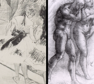
The Online Manga University study group is reading through Harold Speed’s The Practice and Science of Drawing (first published in 1900). Chapter one, the introduction, is a discussion on ‘what is art?’ and ‘what is the purpose of art?’, with an added comparison on ‘art for art’s sake’ with ‘art for subject’s sake’. A little light reading to get us started, then(!).

Starting off, Speed quotes Ruskin and externalises the artistic impulse into something which acts through the artist. “Not in him, but through him” is a sentiment which comes up again and again whenever people take a philosophical approach to art – the idea that, as artists, we are a conduit for some ineffable creative spirit rather than the source. It’s not a bad idea, nor one I necessarily disagree with, but it has an element of spirituality – of submitting yourself to a higher power – and carries a connotation that whatever is achieved by the artist is not entirely their doing, and I’m inclined to resist that idea. Maybe it’s me being arrogant or idealistic or just a godless heathen, but the idea that I’m a tool operated by an external agent and (perhaps) ultimately not responsible for what I’m moved to create doesn’t sit well with me.
Moving on.
Speed says “[it] is the business of the artist to develop his talent so that it may produce a fit instrument for the expression of whatever it may be given him to express, which is fair enough. Translating a concept to a physical object is a seriously difficult job and I can’t disagree that any artist worth the title should strive to be able to execute the concept (wherever it came from) as faithfully as possible. This means using the best tool for the job, as Speed points out:

Each art has certain emotions belonging to the particular sense perceptions associated with it. There are some that only music can convey[…]; others that only painting, sculpture or architecture can convey […]. In abstract form and colour – that is, form and colour unconnected with natural appearances – there is an emotional power, such as there is in music, the sounds of which have no direct connection with anything in nature but only with that mysterious sense we have, the sense of harmony, beauty or rhythm (all three but different aspects of the same thing).

So, we move from ‘what compels us to create art?’ to ‘why does art appeal to us?’.

Speed quoted Tolstoy at the beginning of the book: “[Art is] an action by means of which one man, having experienced a feeling, intentionally transmits it to others”, although he dismisses it as an inadequate answer to the question ‘what is art?’, I think it’s this intentional transmission of emotion that make art appeal. Art is a very clear, very tangible attempt at communication and music, drawing and painting has the benefit of not being limited by language. Nuance and cultural references might be lost when art is transposed to a different place and time but, if a piece is executed skilfully, it’s a universal language.

Art is the expression of the invisible by means of the visible (Fromentin)

Our experience of things in the world is comprised of more than form and colour – of feelings, emotional response, of connections and correlations and assumptions and inferences – and it’s the job of the artist to explore these feelings, to capture them, and to paint “under the influence of these feelings”.
At this point, Speed introduces the perceived divide between art for art’s sake and art for subject’s sake, and comes down firmly in the middle:

Such deeper feelings are far too intimately associated even with the finer beauties of mere form and colour for the painter to be able to neglect them; no amount of technical knowledge will take the place of feeling, or direct the painter so surely in his selection of what is fine.

Art for art’s sake – “The painter’s concern is with form and colour and paint, and nothing else” – and art for subject’s sake – “Form and colour of appearances are only to be used as a language and give expression to the feeling common to all men” – is a false dichotomy: “Neither position can neglect the other without fatal loss”
The art for art’s sake painter will miss or fail to capture the significance of the subject and descend into arrogance over their mastery of technique while utterly failing to capture the spirit (inner beauty) of the subject, while the art for subject’s sake painter will fail to be convincing, lacking the technical skills required to represent the subject with any accuracy. “The immaterial can only be expressed through the material in art, and the painted symbols of the picture must be very perfect if subtle and elusive meanings are to be conveyed.”

At this point I found myself asking what implications this has for purely abstract art. Are feelings conveyed through entirely non-figurative imagery necessarily more crude because of the broader strokes used? Far from it, argues Speed. With any abstract art, like music, the lack of an identifiable form means that the technical skill of the artist must be exemplary because, without an identifiable subject, the conversation at the heart of the piece relies on the artist’s ability to express emotion through technique.

The expression must be ordered, rhythmic, or whatever word most fitly conveys the idea of these powers, conscious or unconscious, that select and arrange the sensuous material of art, so as to make the most telling impression, by bringing it into relation with our most innate sense of harmony.

Finally we come to Speed’s definition of art: “the rhythmic expression of feeling”, or – alternatively – “the rhythmic expression of life”.

So, then, the measure of an artist is “the quality of their feeling and the fitness of its expression”.
If the artist fails simply recreates what they see with no greater meaning to the work, they’re no better than a mechanical recorder – a camera left running in the woods would do the same job – and galleries would have nothing more to recommend them than holiday snaps. A pretty scene, but not relevant or meaningful unless you were there. Equally, if the artist doesn’t have the skill to express their emotions in an appropriate manner, then they’re basically drawing a smiling face for happiness and a tearful one for sadness with no nuance or room for further emotional engagement

The study, therefore, of the representations of visible nature and of the powers of expression possessed by form and colour is the object of the painter’s training. And a command over this power of representation and expression is absolutely necessary if he is able to be capable of doing anything worthy of his art.